
Article: My Journey Learning Font Making
MY JOURNEY LEARNING FONT MAKING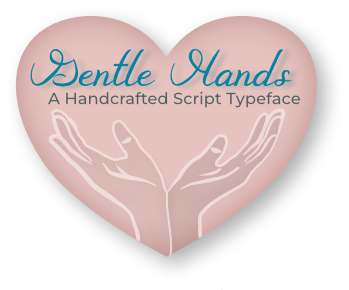
by Janet Lanier
Why did I decide to learn font making?
For the past four years, I was using a digital planner and journal on my iPad and found that making entries using the Apple Pencil revealed how shaky my hands were getting. In 2025, I decided to make all my entries using the typing keyboard and even found a fun font called Jane Austen to go with my Steampunk planner theme. I began to wonder if I could create a cursive style font that looked similar to my own handwriting (only better and without the shaky lines). During this same time I had been finishing up some online art courses through Every Tuesday (every-tuesday.com) when the creator of the courses, Teela Cunningham, offered an online Learn Font Making course. When I completed the course I came to the realization that I had already developed a lot of skills as a composer and instrumentalist that brought an important strength to my font development process. I discovered many, many similarities with font design and music making, so I’d like to pick out just a few and talk about them.
What are some similarities between font making and music making?
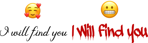
When exploring the many styles of fonts, I thought about how music takes a melody and gives it a different meaning just by changing accompaniments, harmonies, modes, rhythms, or instrumental timbres. It uses accents, dynamics, and even silences to express different meanings. Music also uses accents, slurs, and dynamics to change how a musical phrase is performed. Similarly, fonts use punctuation, varied weights (bold, italic, etc), font sizes, or swashes to change a sentence’s meaning. Two different fonts can give a completely different interpretation to the same phrase.
What music insights can transfer to the font making process?
In my earlier music education years, I was in a music theory class where we would handwrite our musical examples in pencil and show them to the instructor. We all had the chance to see each other’s work and play through them. I had a unique but important takeaway from this experience. The hand manuscript on a few of the entries was difficult to read. Of course the student who wrote the passages could read it because they had heard it in their head and played it on the piano many times during development. The manuscript was difficult to read for varied reasons. Sometimes it was because there were notation errors such as the accidentals might be on the wrong side of the notehead or an eighth note’s flag was on the wrong side of the stem. A student might do their best at drawing a quarter rest and yes, the quarter rest is a tricky symbol but the performer would squint and wonder what that funny symbol was. Most often it was just subtle things like the lack of beaming notes together to help the performer know where the main beats were.
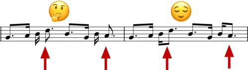
Another awkward entry showed several sixteenth notes in a row with numerous accidentals but the notes were so crammed together or so unevenly distributed, the reader had to pause to figure out what exactly was written.
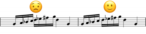
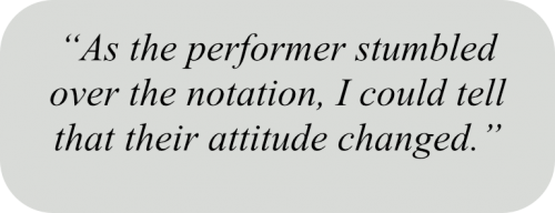 I also noticed in this class that as the performer stumbled over the notation, I could tell that their attitude changed. They didn’t seem to put in as much musicality as they normally would. The awkward notation got in the way of the performer’s experience. This “ah-ha moment” made me see that if I wanted a performer to put their best efforts into my so‑called “masterpieces,” I needed to do my part by notating it as cleanly and correctly as I could. I wanted the performers to trust me and know they were about to play something beautiful, something interesting, something well-written.
When music writing software came out, it was wonderful. No more erasing and stressing over inserting a measure here and there. I worked with the Finale app for many years and then switched to a free open source program called MuseScore. These programs were such time savers when creating music compositions not only because you could copy, paste, duplicate, insert, but because they would automatically space the notes for you. However, you still had to check spacings and adjust when necessary.
When it came time for me to study font making, I was so grateful for my prior music experiences. The music notes were now my font glyphs. Spacing mattered in the font world just as much as it did in the music world and my goal from music notation still applied to font making. I wanted the font user to trust me and know that the meaning of their words would not be held back by a clumsy font.
How do you change the spacing in a font?
In font making, you use side bearings, kernings, and kerning groups to adjust spaces between glyphs. This helps to create a flow and rhythm to the letters as they progress across the page. This part of font making is probably the most time-consuming. The following two examples show a before and after view of my font Gentle Hands.

The first example has no side bearings, kernings, or kerning groups assigned. The second example has a side bearing and a kerning group assigned for every single letter and many of the letter pairs have a kerning adjustment between them. After comparing these before and after examples, you can probably see why the reading experience (just like in music reading) would be very different if these spacing adjustments were left out.
My font Gentle Hands was a script font that looked like cursive handwriting. When you have a cursive style font the letters have exit stems and those stems flow into the next letter. Not all letters have an exit stem but most do. One might see the similarity between exit stems and beaming notes in music. It helps the reader read words rather than individual letters.

Both music and fonts require space adjustments to avoid collisions, to tighten gaps, or to open up tight spacings. For example, the Gentle Hands font has ascenders (b, d, f, h, k, l, and t) with parts of the letter ascending above the x-height and descenders (f, g, j, p, q, and y) with parts of the letter descending below the baseline.
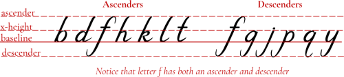
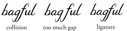
These can cause open gaps, awkward tension or even collisions with adjacent letters. I found working with all these details and making creative choices to be one of the fun parts of font making. It seemed so familiar to me because it was so much like music arranging. In music, sometimes there would be a passage that seemed awkward and I didn’t know quite what to do at that moment. But the next day, using fresh eyes (and ears), the fix seemed so obvious, almost easy to me. I often had those same kind of moments in the font designing process. For example, I had the letters gf and they had colliding descenders. Spreading them further apart only created another visual problem. Perhaps designing a ligature was in order! A ligature is a combination of two or more glyphs designed as one element. Now whenever the letters gf are typed, the programming feature of the font automatically kicks in the ligature I designed.
So many rules!
In both music notation and font making, there are rules. So many rules! As mentioned before, symbols like the flat, sharp, or natural must sit before the notehead, not after — that’s simply the rule. A musical piece starts out with a clef, followed by the key signature, followed by the time signature in that exact order. To deviate from that order would send a signal to the performer that something is off.
I remember a music composition teacher correcting me on how I used a particular music navigation symbol in my assignment. I said, “But I’ve seen it written like that in music I’ve played.” He replied, “Maybe you have, but just because you’ve seen it that way doesn’t mean it’s correct.” Ouch!
In font making, I spent a lot of time researching the rules for letters, symbols, punctuation, etc. Just because you can read a book doesn’t mean you know those rules. It was particularly challenging with languages that I was not familiar with. What is a thorn (þ)? What language uses it? What is the correct size and shape of that character within a font and where does it need to be placed vertically? Should it have an exit stem in a cursive font?
Another example is what is the difference between a hyphen, minus sign, en dash, and em dash? How do their lengths compare? Are they all in the same location vertically? What is their correct use? You might know when to use a minus sign, but when do you use an em dash and not an en dash? Like I said, “so many rules!” You might be thinking these rules are so tedious and wondering are they really that important? This is where font designing becomes a craft, perhaps artistry. I could pick up an unfamiliar musical instrument and pick out a tune on it but the more I know about that instrument and the more I know about the music I’m playing, the closer I get to the craft, the artistry. Both music making and font making take practice to achieve this. So much practice!
Did any of the font making insights translate back to my music?
While working on my font, I faithfully kept a detailed spreadsheet and constantly referred to it. 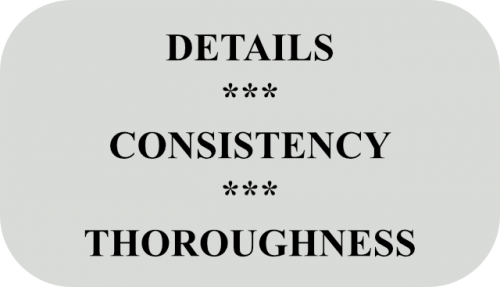 There were so many details to keep in mind! After all, I had 313 glyphs in this font and there were hundreds, if not thousands of decisions and steps to take. Some were general goals to remember, but most were just tiny details and steps to check. I had almost a mantra going in my head each time I consulted with my spreadsheet: details - consistency - thoroughness, details - consistency - thoroughness! It kept my intentions in check and prevented a lot of unnecessary “side quests.” When I saw how much I relied on that spreadsheet I felt it might also be a useful tool in music making as well.
What would it look like if I kept a spreadsheet when I practiced or composed? I certainly could set up a plan to remind me what to work on next time. I could ask myself questions about the piece, maybe set a task for the next practice session, create checklists of details that need my attention. Each piece would dictate a different strategy. What if I isolated a problem measure and rewrote it in a different key or with a different rhythm to practice next time? Maybe I could set up a schedule for scale practice that coincides with the keys of the pieces I’m working on. The spreadsheet could also have research notes about the history of the piece I’m performing or arranging.
 My point is maybe it would be beneficial to keep documentation in our music making to become more intentional. It’s easy to lose track of the intention part. Music is supposed to be fun but maybe more fun if we got better at it!
If you would like to see a full PDF of this article, click on this link My Journey Learning Font Making